Built from the library
The system,
assembled
Every screen is a library instance — no local components, no detached styles.
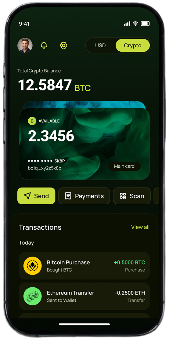 Crypto balance
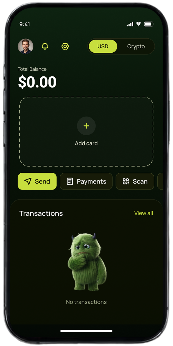 Empty state
An internal wallet that pays salaries in crypto. Every transfer is irreversible — and that one fact shaped every token, component and rule below.
That turned into three requirements everything else had to meet.
Three variants, every state. Lime is earned — reserved for the one forward action per screen, never spent on something that can be undone.
One control height per context. The 44px hit area is the floor on touch.
Sending money cannot be undone — so it never wears Primary. An action you cannot take back must never be the most inviting thing on the screen. Danger is reserved for destruction, never dressed up as an invitation.
A colour you cannot rebind to a theme will break the moment the theme changes — so the system does not allow one to exist.
Roboto tabular figures — 1,200.00 never jitters against 250.00. Never demoted to a label.
Direction drives the colour. A failed incoming is still Positive — success is a status, direction is a fact.
Total lifts onto the amount ramp while every line above stays quiet — on the screen you cannot undo.
The hardest part of a design system is not building it. It is making sure it still holds when the person who built it is not in the room. Four things do that work here.
Components are created in the system file and consumed as library instances — never drawn locally in the working file. A component that can be built by hand will be built by hand, so the system removes the option.
All 14 sets carry a documentation frame next to the component: what each variant is for, which tokens it binds, what it must never do. A rule that lives only in someone's head is not a rule.
The mascot appears in onboarding, empty states and salary-received screens only — never on an error, a confirmation, or any screen that moves money. Money leaving an account is not a moment for a character.
Where a rule can be enforced by the component itself, it is: Tone is one axis so a pair can't be broken, a Segment can't be placed without a SegmentedControl, a theme is a mode and never a component property. The best rule is the one you cannot break.
Every screen is a library instance — no local components, no detached styles.
Crypto balance
Empty state


Every token, component and documentation frame in this case — 139 tokens, 16 components, 454 icons — in the working file.